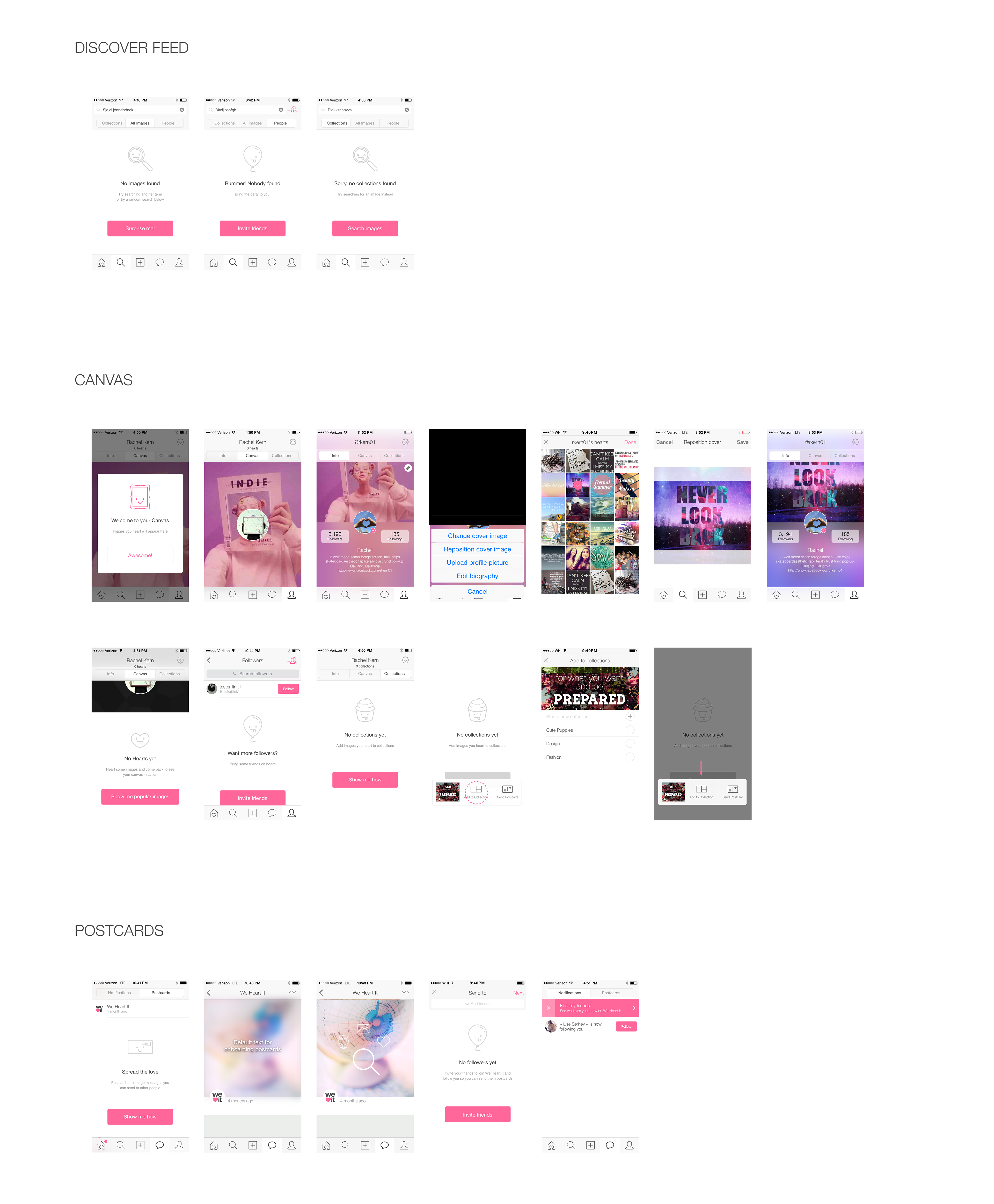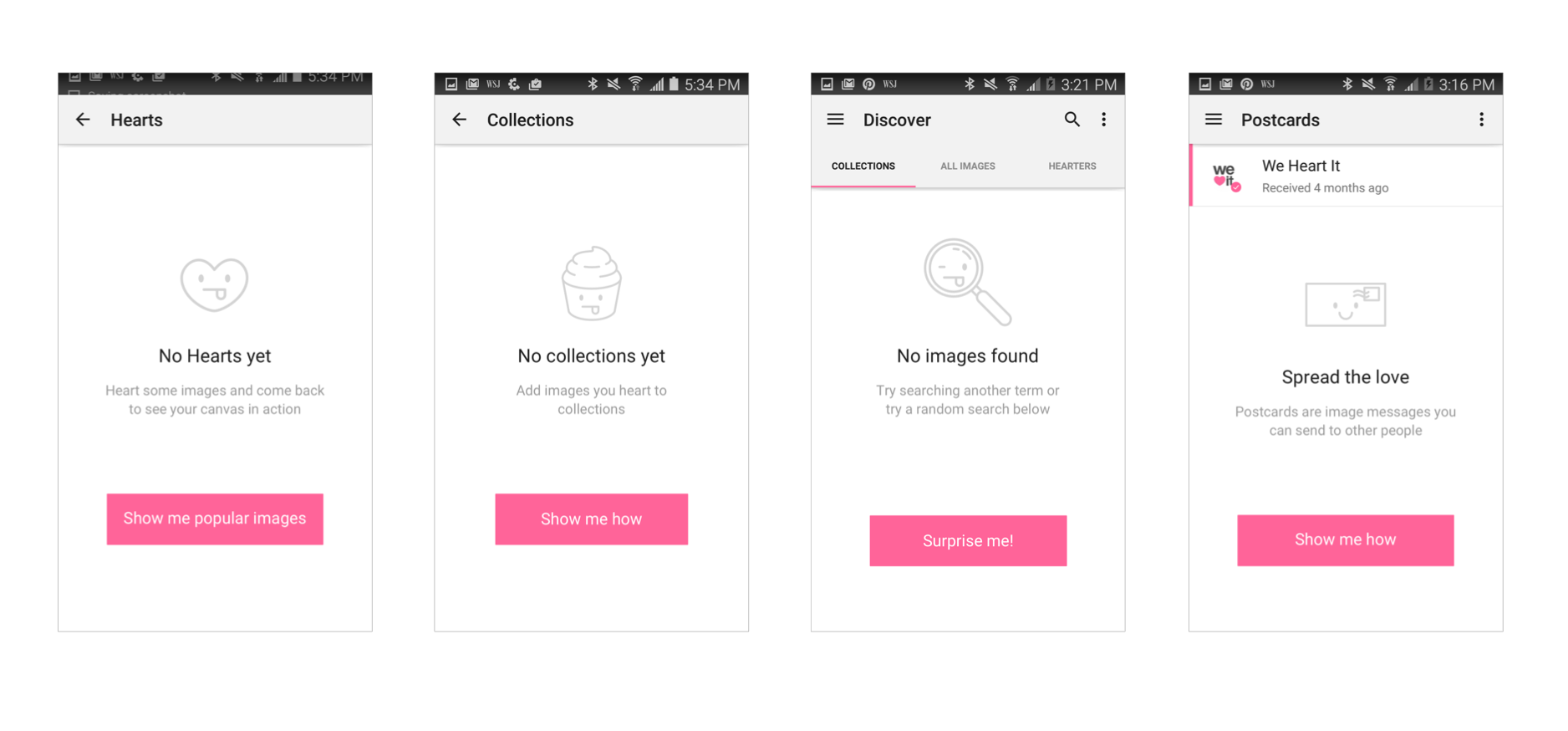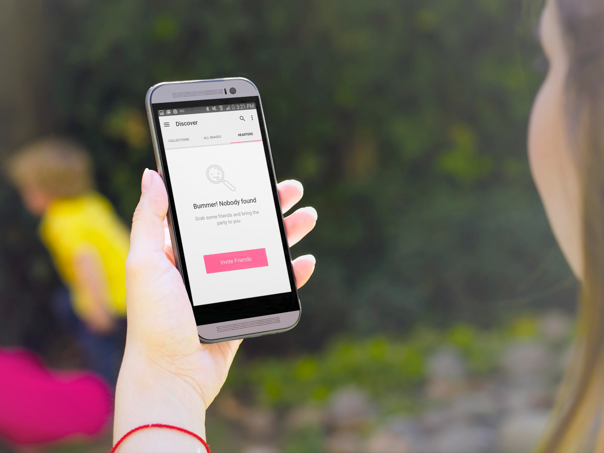
Problem:
As a user, dead-end screens are a bummer, and it leaves me feeling stuck. Goal: Reduce churn, and improve overall usability by solving for dead-ends and empty states.
Process:
Created a directory of all possible dead-ends and empty states.
Sketched/mocked user flows to show the results of each action.
Worked with marketing to create a series of CTA's that were playful, informative, and relevant to each screen they pertained to.
Curated a series of playful icons to complement the message and create a more visually engaging experience.
Ensured designs corresponded with brand voice and guidelines. Solution: A series of engaging designs that allow the user to move seamlessly through the app, while suggesting actions which would help the user avert similar instances in the future. How did we quantify success? By comparing month over month churn rates, as well as looking at click-through rates on empty state CTAs.
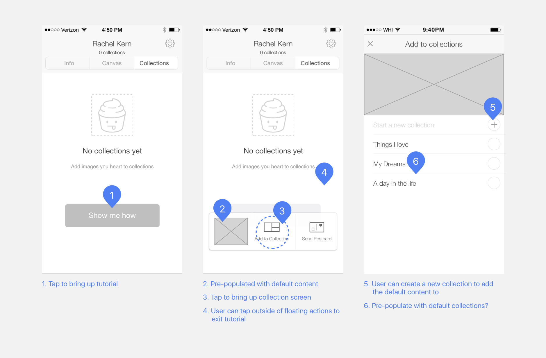
Sample of wireframes for when a user has not yet created a collection.